

Scroll To Continue ↓
I’ve been noticing more Scroll-To-Continue product pages lately.
They are especially popular among technology marketers (Apple, Tesla, Adobe) who want to visualize their product experiences in as few taps as possible.
The SCT format allows them to pack a product demo into a single page view, with no clicking required. And without making the page excessively big.
Let’s take an example from Adobe XD product page.
The layout is a familiar stack of content modules - overview, features, demo, related products, user stories.
But the demo breaks the page with scrollable content within content.
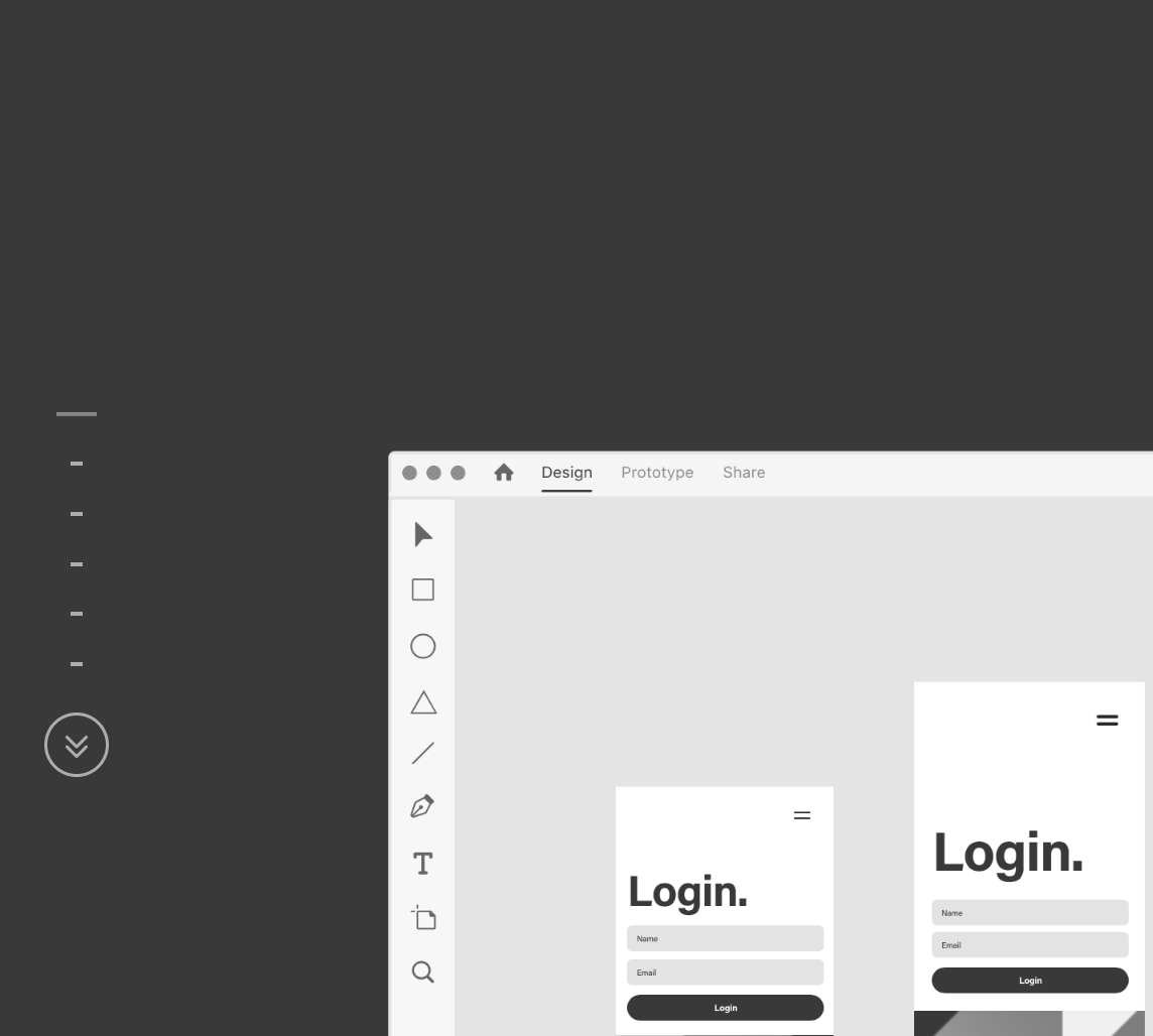
How does it work?
It starts at the top with an animated, bouncing down-arrow and the CTA “Scroll To Continue”.
↓
Once inside the demo, XD’s core capabilities - designing, prototyping and sharing - are presented as a series of annotated views.
Each segment of the demo advances by scrolling down.
The Design segment shows how XD users can sketch wireframes and mockups, on any screen.
The Prototype segment, shows how XD users can add illustrations and images to mockups, and test interactivity across screens and devices.
The Share segment shows how XD users can handoff prototypes, collect feedback and iterate.
The static guide (shown above, on left side of screenshot, with measurement ticks and double arrow down) shows users where they are in the demo and enables them to skip, if they choose.
↓
Going back to the top, the purpose of the site is to sell subscriptions to XD and high-contrast “Start for free” and “Buy now” buttons appear up and down the page.
But the purpose of the page, and specifically the demo, is to share the product experience.
More of these, please!
https://www.adobe.com/products/xd.html


